I'm a Product Designer based in Italy 🇮🇹, passionate about turning complexity into clarity.
I design digital experiences that bridge product, business, and technology. From empowering users through thoughtful workflows to creating playful, engaging interfaces inspired by games and space (when possible).
Currently at Treedom 🌳, making satellite data readable for people and sustainability measurable for businesses. Previously built open-source app for 120,000 students and co-designed educational platforms that teachers actually enjoy using.
When I'm not designing, you'll find me exploring comics, video games, or dreaming about the stars.
Building my own money management app after testing 15+ existing solutions that all missed the mark. Focus on transaction categorization that actually makes sense and budgeting that adapts to real life rather than forcing rigid categories. Currently prototyping the insight engine that identifies spending patterns without judgment, because guilt isn't a sustainable financial strategy.
Immich Photo Server
RaspberryPi · 2025 - Present
Self-hosted Google Photos alternative on Raspberry Pi, managing 50,000+ family photos. Key learning: the best interface is invisible. Automatic backup, facial recognition, and search that just works. Privacy and ownership without sacrificing convenience.
Lexi Vocabulary App
iOS Game · 2014
Side project exploring gamified micro-learning. Built end-to-end from research through App Store release. Key learning: retention mechanics that work in games (streaks, rewards) need careful adaptation for education. The cognitive load of learning requires simpler UI than gaming allows.
Infostud App
Open Source Android · 2014
Released to 120,000 Sapienza students. Designed a mobile interface to streamline access to academic resources and student services, focusing on usability and accessibility. Key insight: large-scale educational apps must prioritize clarity and minimal cognitive load for diverse users.
I'm a Product Designer based in Italy 🇮🇹, passionate about turning complexity into clarity.
I design digital experiences that bridge product, business, and technology. From empowering users through thoughtful workflows to creating playful, engaging interfaces inspired by games and space.
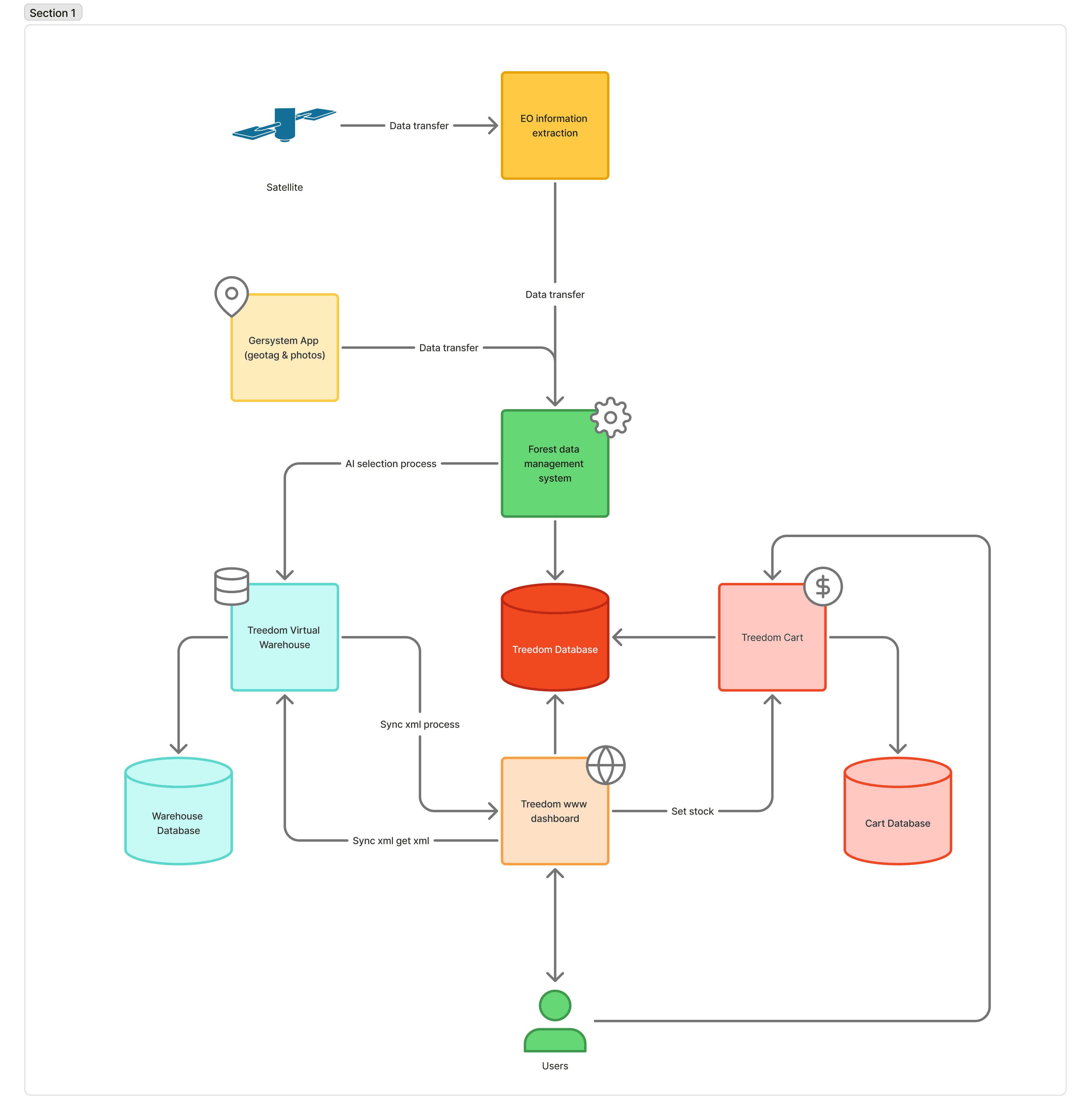
Currently at Treedom 🌳, making satellite data readable for people and sustainability measurable for businesses.
Experience
Product Designer
Treedom
Jul 2021 - Present · Italy
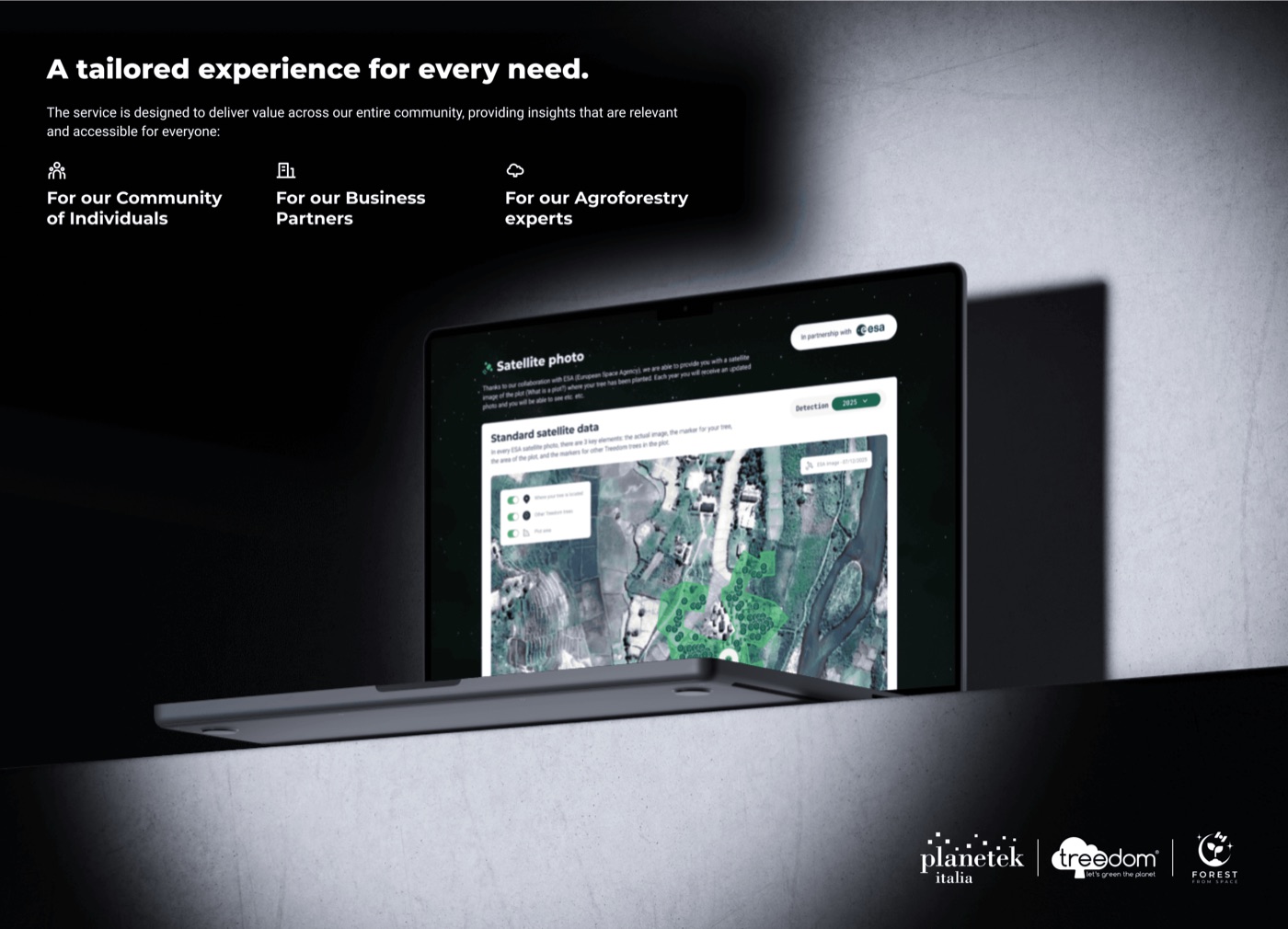
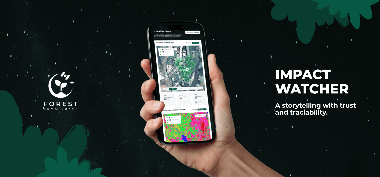
Design systems, the B2B impact dashboard, and the ESA satellite data platform bringing environmental monitoring to non-technical users across Ecuador and Madagascar.
Co-Lead Designer
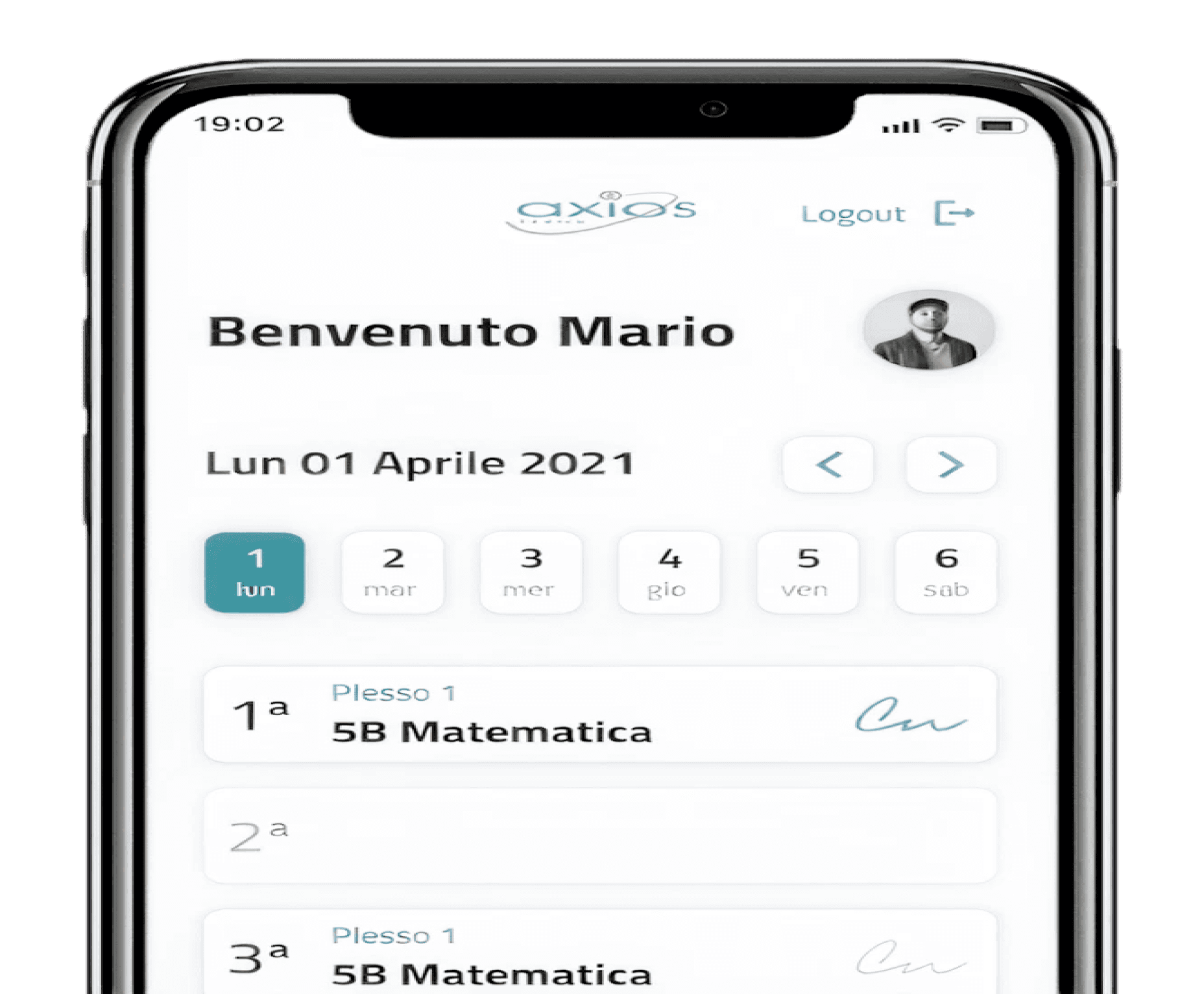
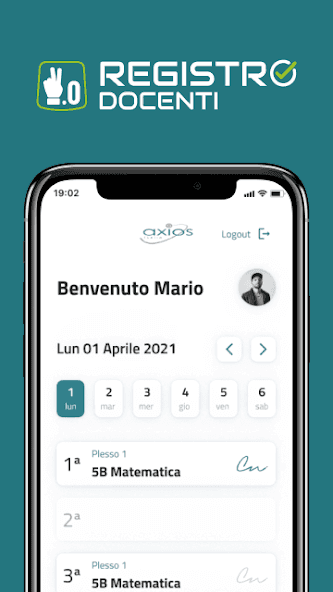
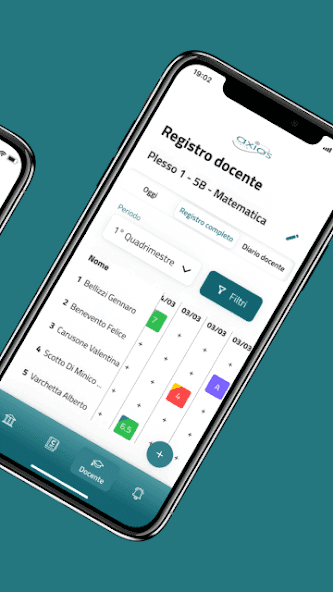
Digital School Register
Apr 2021 - Jul 2021 · Italy
Modernized Italy's education infrastructure, achieving 95% adoption among 3,000+ teachers across 50 schools.
Tools I use
List coming soon.
When not designing…
📚 Reading🎮 Video games💬 Comics🚀 Dreaming about the stars
Transforming complex satellite data into actionable insights for non-technical users, enabling Ecuador and Madagascar to monitor environmental changes in real-time.
My Role
Lead Product Designer
Duration
June 2025 - Present
Platform
Web & Mobile Responsive
Collaborators
2 Backend Engineers, 1 Data Scientist, 3 ESA Scientists, 1 PM
Overview
The ESA platform democratizes access to satellite environmental data, previously accessible only to scientists. As lead designer, I created an intuitive interface that translates complex datasets into clear visualizations for farmers and land managers across Madagascar and Ecuador.
Problem Statement
Agricultural stakeholders need environmental data for decision-making but lack the technical expertise to interpret raw satellite information. Current tools require 15+ minutes of analysis and scientific knowledge, creating barriers to adoption.
Research
Discovery Phase
To understand how non-technical users interact with complex data, I conducted 25 interviews with farmers and land managers, facilitated 3 workshops with ESA scientists, and shadowed current data analysts.
Expertise gap: Users need insights, not raw data visualization
Time constraints: Decisions needed within 2-minute windows during field work
Mobile context: 70% check data on mobile devices in the field
Trust barrier: Users skeptical of automated interpretations without transparency
Iteration 1
How might we simplify satellite data without losing scientific accuracy?
Iteration 1
Working with stakeholders
I collaborated with ESA scientists to establish accuracy thresholds for simplified visualizations while maintaining scientific integrity. With engineers, I mapped API constraints for real-time processing and data layering capabilities.
Design Decisions
Progressive data layers
Three-tier architecture: Basic view for quick insights, Detailed view for trends, Expert mode for raw data.
Context-aware tooltips
Translation layer converting scientific terminology into agricultural language, validated through user testing.
Did it work?
Yes, partially. Interpretation time reduced from 15 to 5 minutes with 85% accuracy in user understanding. Power users felt constrained and requested more detailed data layers without switching contexts.
Iteration 2
How might we create an adaptive interface that serves both novice and expert users?
Iteration 2
Journey mapping & prioritization
I synthesized research findings into a journey map visualizing the decision-making process from data request to action, identifying where different user types diverged. With the PM, we prioritized user profiles that automatically adjust interface complexity based on usage patterns.
Design Decisions
Adaptive interface system
Intelligent system that learns from user behavior, progressively revealing advanced features as expertise grows.
Collaborative annotations
Community-driven insights where experienced users annotate data for others, creating a knowledge-sharing ecosystem.
Final
Outcomes
2 min
average interpretation time
92%
task completion rate
500+
active users across EU
Final Takeaways
Balancing simplicity with depth
Oversimplification can alienate power users. Progressive disclosure became our bridge between accessibility and functionality.
Scientific collaboration is design research
Working with ESA scientists showed me that domain experts are invaluable design partners when treated as co-creators rather than just validators.
Community features multiply value
The annotation system unexpectedly became the most valued feature, proving that peer learning can be more powerful than perfect UI.
Modernizing Italy's education infrastructure while achieving 95% adoption among 3,000+ teachers.
My Role
Co-Lead Designer
Duration
Apr - Jul 2021
Platform
iOS, Android, Web
Collaborators
Senior Designer, Ministry Reps, 20 School Directors, 3,000+ Teachers
Overview
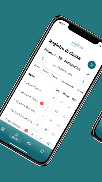
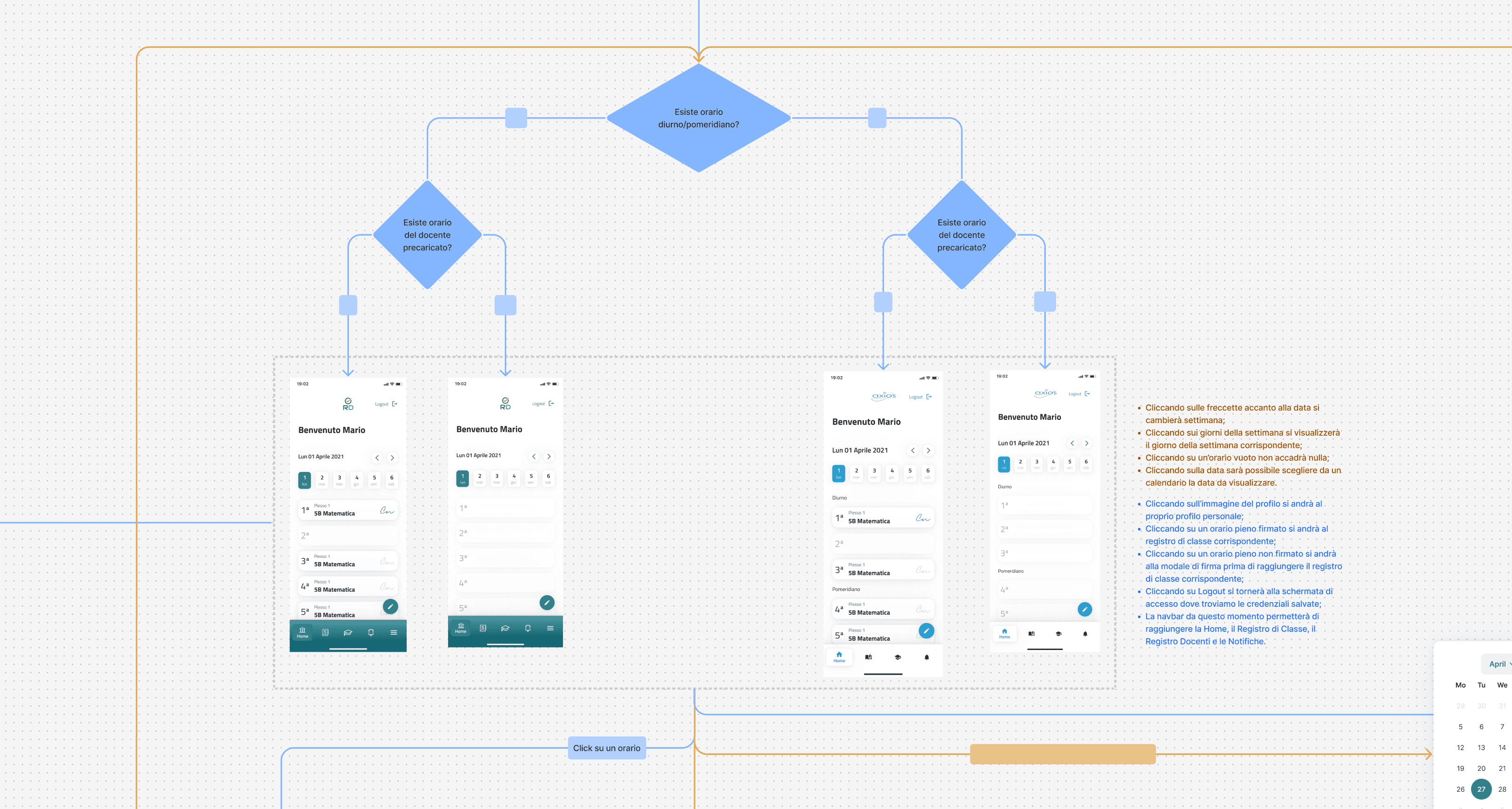
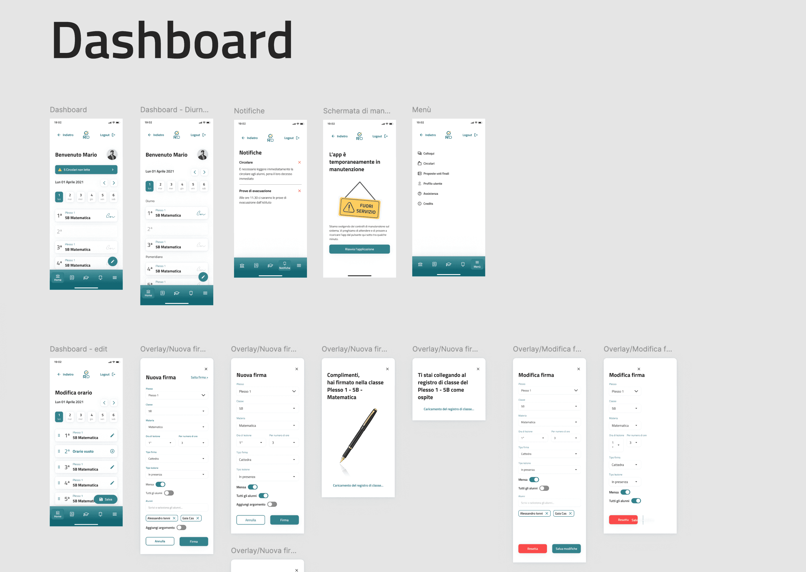
The Digital School Register transforms a legacy government system into a modern, accessible platform serving 3,000+ teachers across 50 schools. As co-lead designer, I balanced strict regulatory requirements with intuitive user experience to achieve unprecedented adoption rates.
Problem Statement
Teachers aged 35-65 struggle with the mandatory digital grade reporting system. The existing platform generates 200+ daily support tickets with 40% error rates in data entry, causing compliance issues and teacher frustration.
Research
Discovery Phase
To understand the intersection of regulatory requirements and user needs, I conducted 30 shadowing sessions during grade entry, analyzed 6 months of support tickets, and facilitated 5 co-design workshops.
Compliance anxiety: Fear of regulatory violations paralyzes decision-making
Time pressure: Grade entry happens in 5-minute breaks between classes
Device fragmentation: Personal phones to decade-old school computers
Support burden: Younger teachers become unofficial IT support
Iteration 1
How might we ensure 100% compliance while reducing cognitive load?
Iteration 1
Working with Ministry & Stakeholders
Weekly validation sessions with legal teams ensured every interaction pattern met regulatory standards. I mapped competing priorities between ministry (compliance), teachers (simplicity), and directors (efficiency), using collaborative workshops to find common ground.
Design Decisions
Guided compliance workflows
Step-by-step processes with built-in compliance checks, making regulatory violations technically impossible.
Smart error prevention
Contextual validation explaining why inputs are invalid, teaching compliance through usage, not documentation.
Did it work?
Partially. Achieved 100% compliance but only 60% task completion rate. Teachers reported the system felt "like filling tax forms": technically correct but emotionally exhausting.
Iteration 2
How might we make compliance feel effortless rather than enforced?
Iteration 2
Co-design workshops
I facilitated 6 sessions mixing teachers, directors, and ministry reps, using card sorting and journey mapping to redesign information architecture collaboratively.
Design Decisions
Smart defaults system
Analyzed usage patterns to pre-populate fields, reducing a 12-step process to 4 essential decisions.
Batch operations
Grade multiple students simultaneously for common scenarios, balancing efficiency with audit trail requirements.
Offline-first architecture
Offline mode with automatic sync, addressing unreliable school internet. Trust built through visible sync status.
Final
Outcomes
95%
adoption rate, 1st semester
60%
reduction in support tickets
4.2/5
user satisfaction score
Final Takeaways
Compliance through design, not documentation
Instead of teaching rules, we made wrong actions impossible. Compliance shifted from a burden to an invisible safety net.
Co-design with opposing stakeholders works
The workshops revealed that ministry and teachers shared more goals than expected. Finding common ground early prevented months of revisions.
Government projects teach patience and persistence
Working within institutional constraints pushed me to find creative solutions within rigid boundaries.
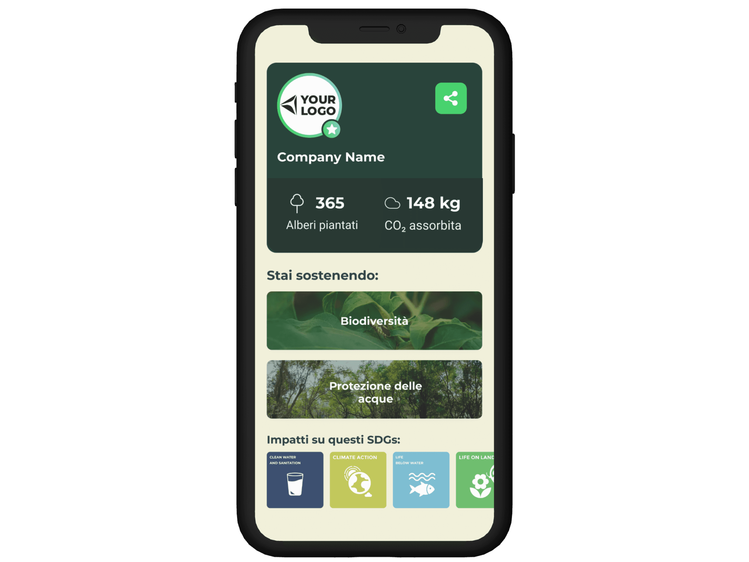
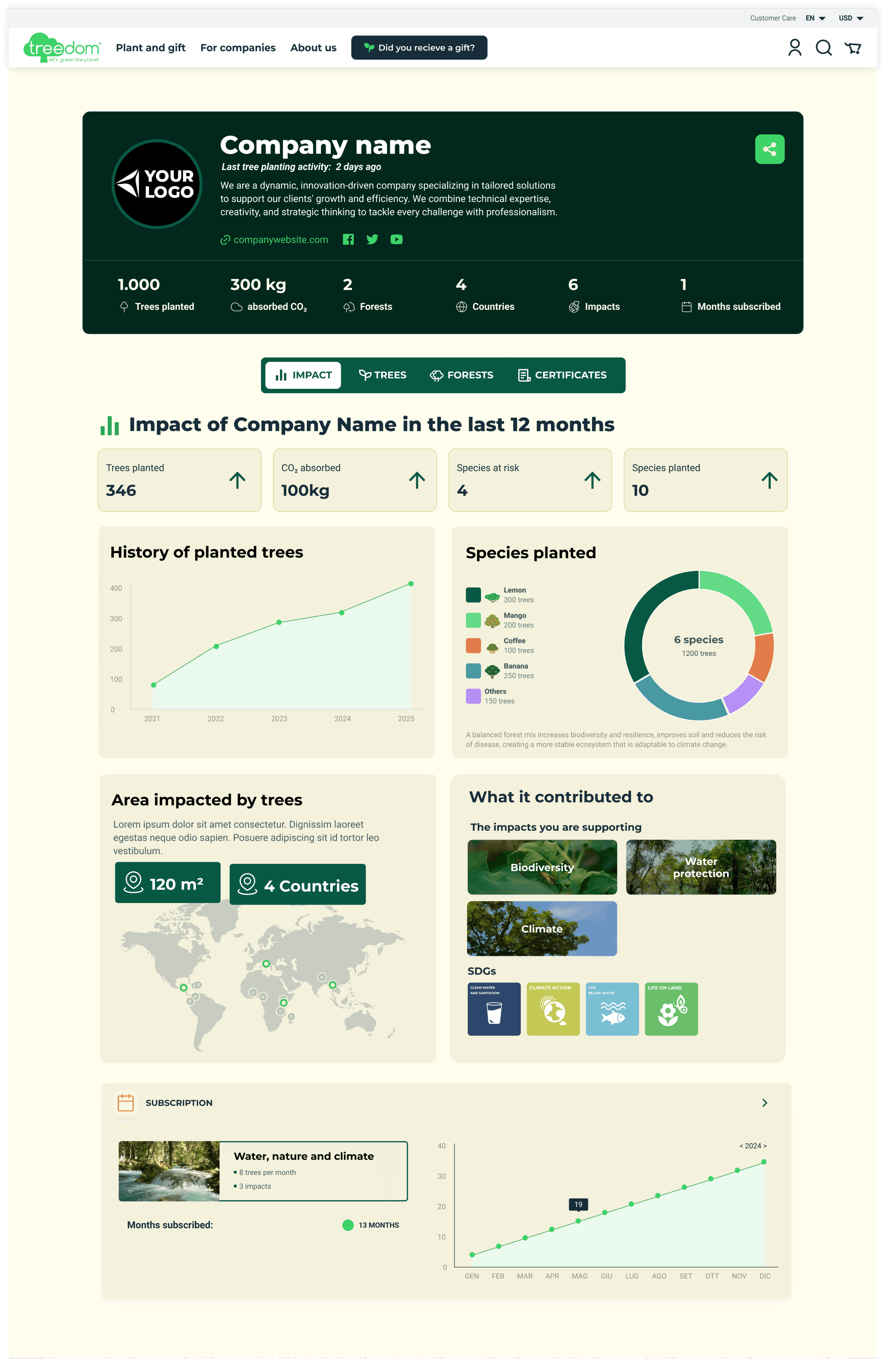
Empowering companies to track and communicate environmental impact, increasing retention by 40% and identifying €2M in new opportunities.
My Role
Lead Designer & Workshop Facilitator
Duration
Feb 2024 - Present
Platform
Web Platform
Collaborators
CEO, Sales Director, 3 Account Managers, 2 Engineers, Marketing Lead
Overview
The B2B Dashboard transformation enabled 500+ corporate clients to quantify, visualize, and share their environmental impact. As lead designer, I turned abstract sustainability metrics into compelling business narratives that drive retention and growth.
Problem Statement
B2B clients struggled to justify ROI of environmental initiatives to their stakeholders. Manual report creation took 4+ hours monthly, while 30% annual churn indicated clients couldn't demonstrate value internally.
Research
Discovery Phase
To understand enterprise sustainability reporting needs, I conducted 40 interviews with decision-makers, analyzed 200 support tickets, and attended quarterly business reviews.
ROI pressure: CFOs need quantifiable impact metrics for budget approval
Department silos: HR, Marketing, and CSR need different data views
Story gap: Data exists but lacks compelling narrative
Iteration 1
How might we automate reporting while maintaining customization needs?
Workshop facilitation
I led a Design Sprint with 8 senior stakeholders, using RICE scoring for feature prioritization and identifying €2M in untapped opportunities.
Design Decisions
Modular metric system
Drag-and-drop dashboard builder allowing clients to customize their view without development involvement.
Automated insights generation
AI-assisted narrative generator creating report summaries from data patterns, with editable templates.
Did it work?
Yes, but incomplete. Report creation time dropped 75%, but clients still struggled with internal storytelling. They could show data but couldn't connect it to business outcomes.
Iteration 2
How might we help companies connect environmental action to business value?
Strategic pivot
Working with the CEO and Sales Director, we repositioned the dashboard from reporting tool to business intelligence platform, focusing on correlating environmental initiatives with business KPIs.
Design Decisions
Business impact translator
Overlays showing how environmental metrics affect employer branding, customer acquisition, and employee engagement.
Multi-stakeholder views
Role-based dashboards for HR, Marketing, and CSR, all sharing the same data layer with different narrative frameworks per audience.
White-label storytelling
Companies embed dashboards in their own platforms with full brand customization while maintaining functionality.
Final
Outcomes
40%
increase in retention rate
3×
upselling rate
4h→10m
report generation time
Final Takeaways
Facilitating workshops is product design
The strategic sessions revealed insights no interview could surface. Leading these discussions became as important as pixel-pushing.
B2B design is about enabling internal champions
Our users needed to sell internally. Every feature was designed to help them tell better stories to their stakeholders.
Prototypes close deals
High-fidelity prototypes with real client data became our most powerful sales tool, proving design's direct revenue impact.
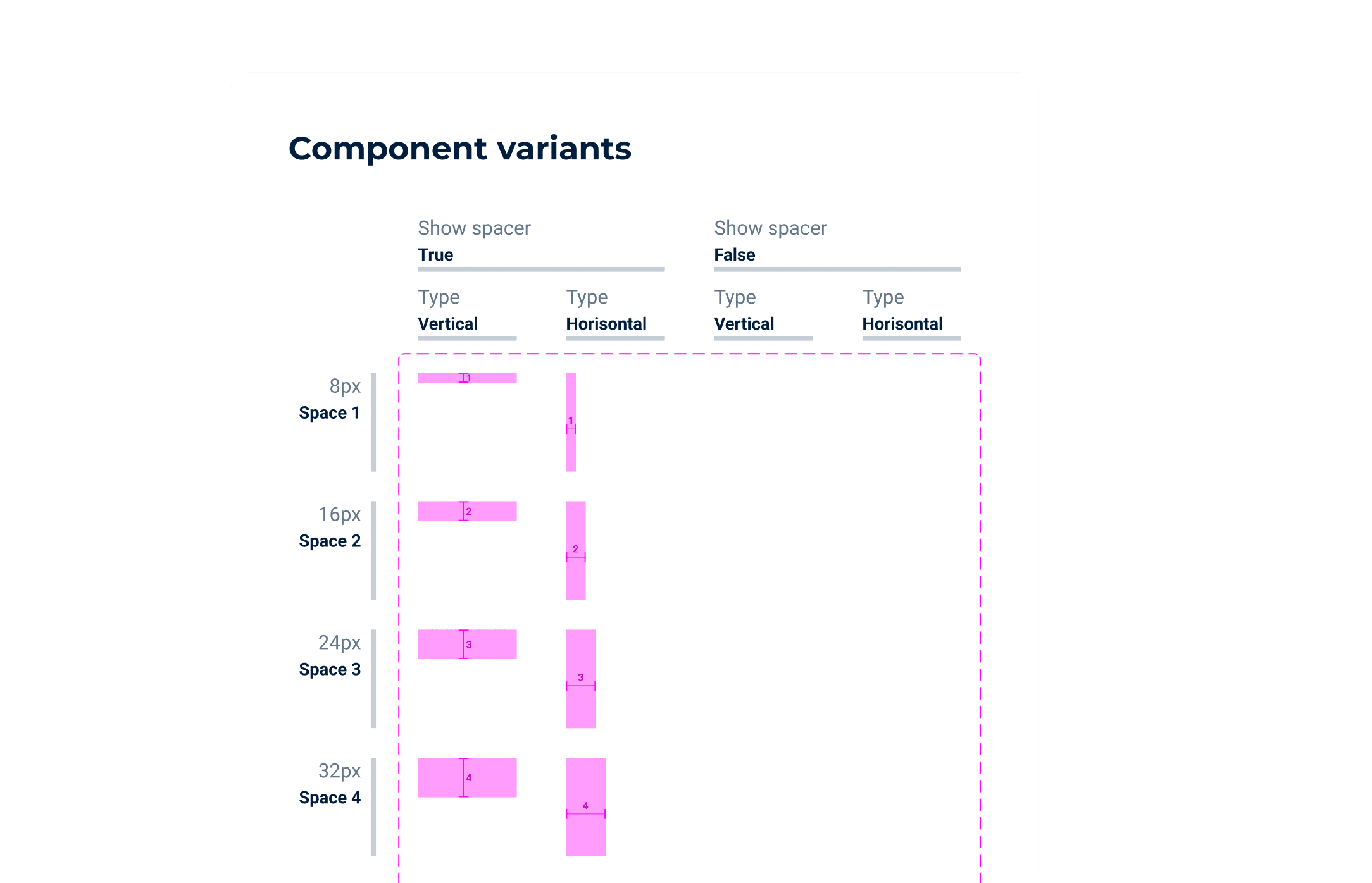
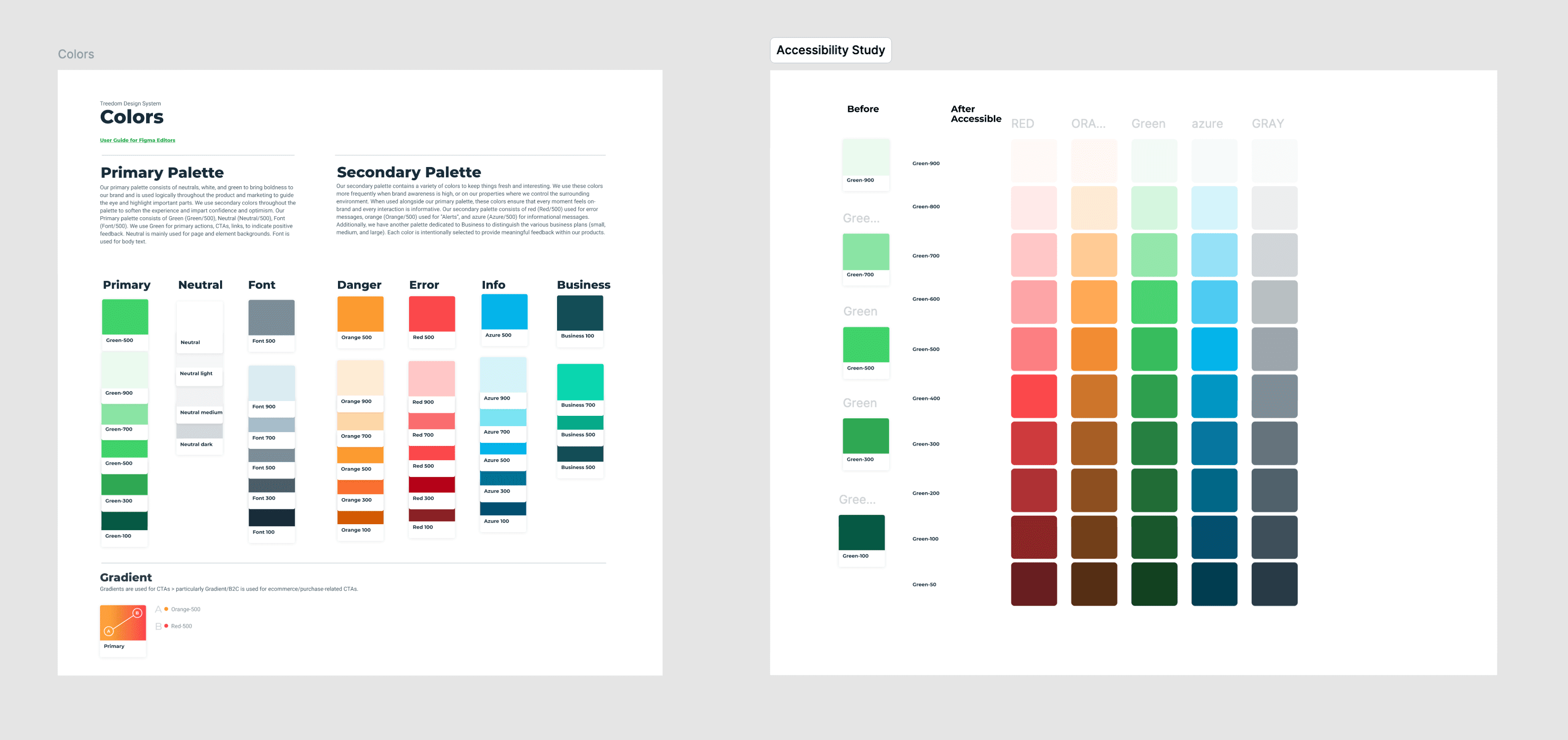
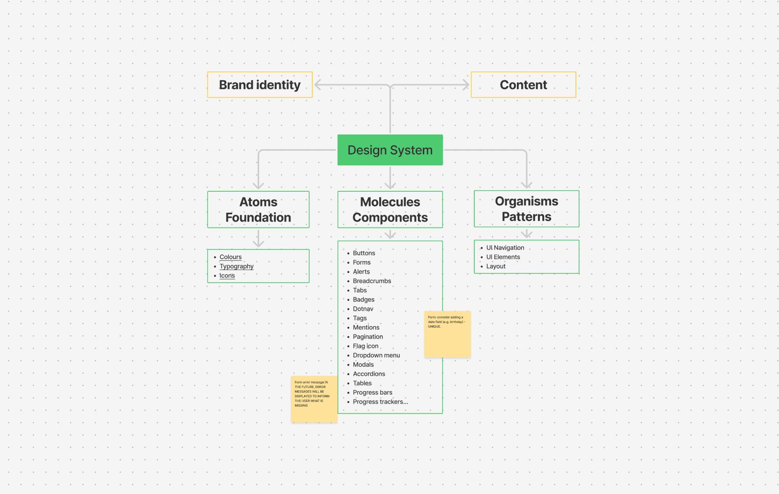
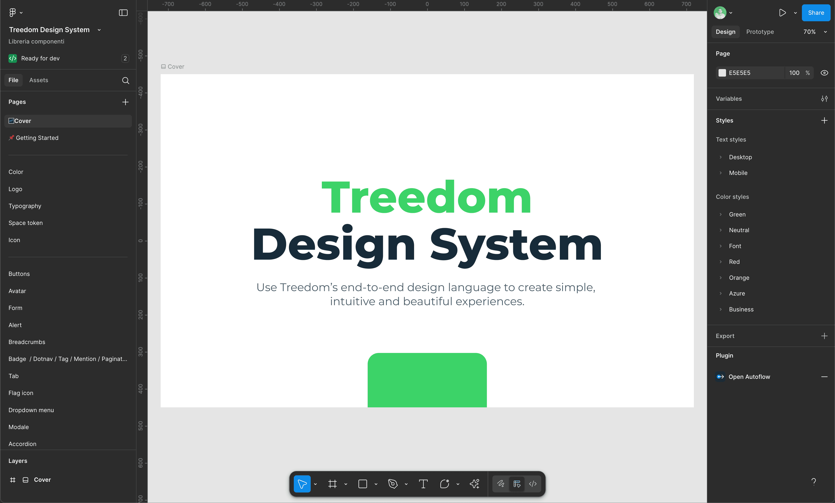
The Treedom Design System unified design language across B2C and B2B products, establishing a single source of truth for design decisions. As system lead, I transformed fragmented components into cohesive, scalable infrastructure used by the entire product org.
Problem Statement
Design inconsistencies across products caused 40% development rework, diluted brand presence, and increased QA cycles. Teams worked in silos, recreating similar components with different implementations: the same button existed in seven variations across the codebase.
Research
Discovery Phase
To understand the full scope of fragmentation, I audited 250+ components across platforms, interviewed 15 team members about pain points, and analyzed development velocity metrics over 6 months.
Duplication everywhere: 7 button variants, 4 color tokens named differently across repos
Handoff friction: Designers and engineers spent 30% of sprint time resolving spec ambiguity
Brand dilution: Marketing, B2B, and B2C surfaces felt like different products
Fear of breaking things: Engineers avoided reusing components due to unknown side effects
Iteration 1
How might we establish a shared foundation without halting product delivery?
Audit & token strategy
I ran a full component audit, tagging each element by usage frequency and duplication count. This gave us a prioritized migration roadmap that fixed the most-used components first for maximum leverage with minimum disruption.
Design Decisions
Design token layer
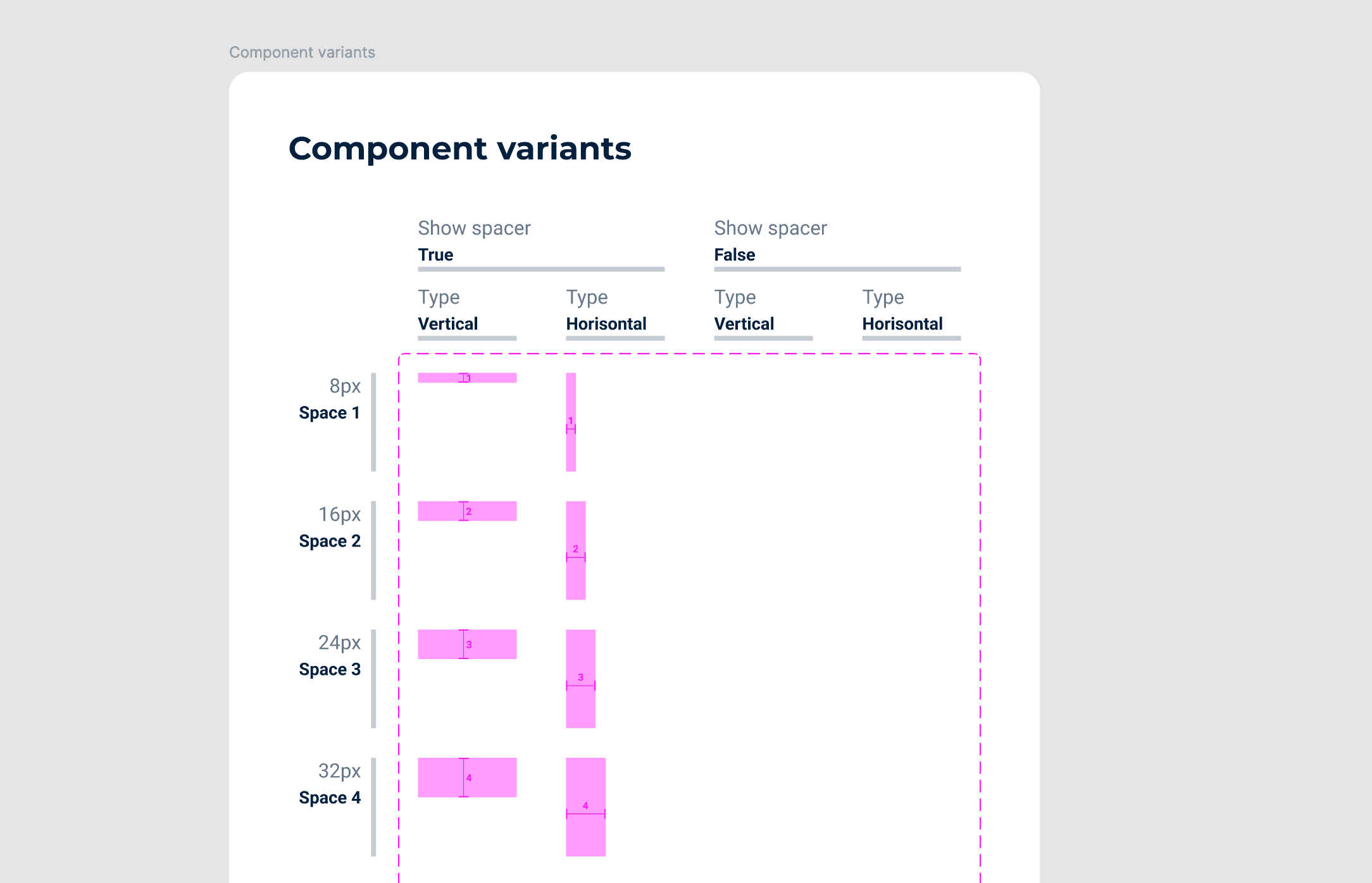
Semantic tokens (color/spacing/typography) as the single source of truth, consumed identically in Figma and Storybook.
Component API contracts
Every component documented with variants, states, and usage rules, making the system self-explanatory.
Did it work?
Partially. Token adoption was strong, but engineers still weren't pulling from the system. They trusted their own implementations more. The problem wasn't the system's quality, it was trust and discoverability.
Iteration 2
How might we make the design system the path of least resistance?
Governance & adoption strategy
I embedded with the engineering team for two sprints to understand their workflow. The insight: engineers needed components that worked out-of-the-box, with clear migration guides and a low-friction contribution process so they felt ownership rather than obligation.
Design Decisions
Living documentation
Storybook stories auto-generated from Figma specs, keeping design and code in sync without manual maintenance.
Contribution model
Any team member could propose new components via a lightweight RFC process, so the system grows with the product.
Migration tooling
Codemods and Figma plugins to automate legacy token replacement, removing friction from adoption.
Final
Outcomes
30%
reduction in development time
250+
components consolidated
3 yrs
maintained & growing
Final Takeaways
A design system is a product, not a project
It needs maintenance, a roadmap, and a feedback loop. Systems that ship once and stagnate lose adoption to local workarounds within months.
Trust is the real adoption barrier
Engineers don't use systems they don't trust. Embedding with the team, shipping with them, and fixing their pain points earned credibility faster than documentation ever could.
Contribution beats control
Gatekeeping slows systems down and breeds resentment. Opening contribution with clear guidelines made the system a team asset rather than a design team constraint.